Top 10

Photobooks of 2023

Selected by Alessandro Merola

As the year draws to a close, an annual tribute to some of the exceptional photobook releases of 2023 – selected by Assistant Editor, Alessandro Merola.

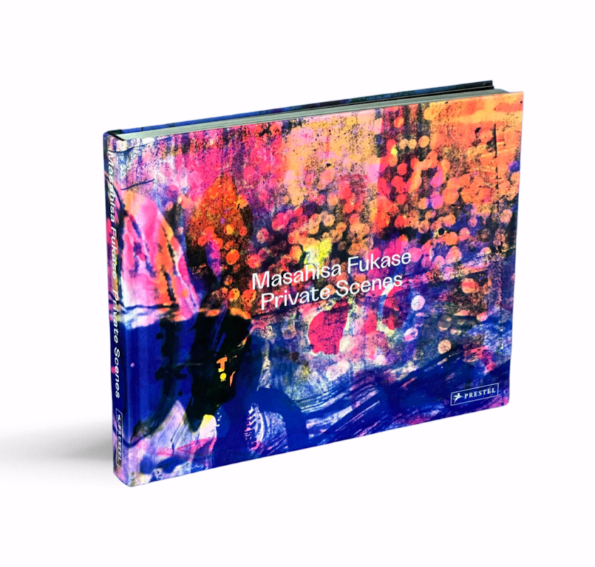
1. Masahisa Fukase, Private Scenes
Prestel

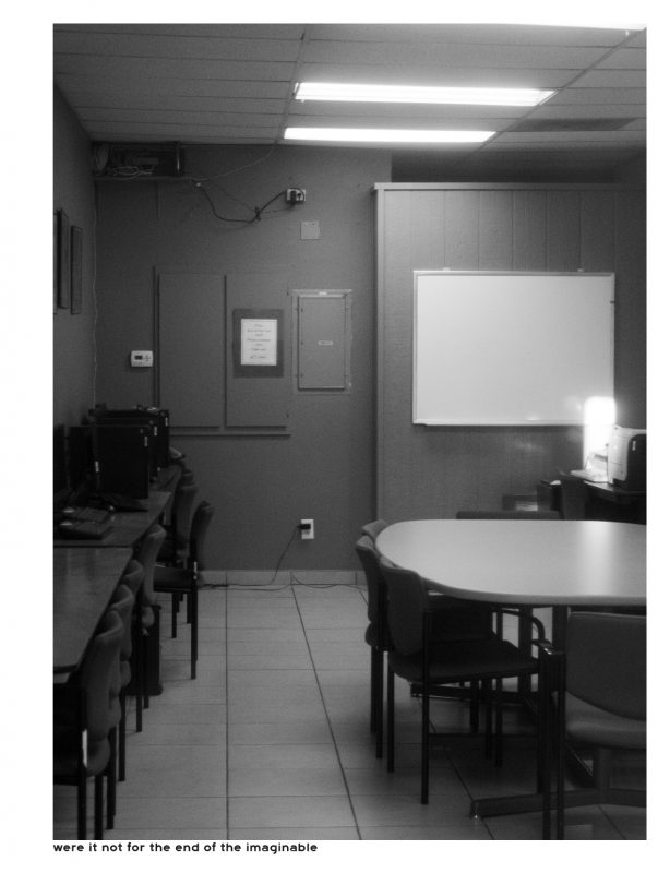
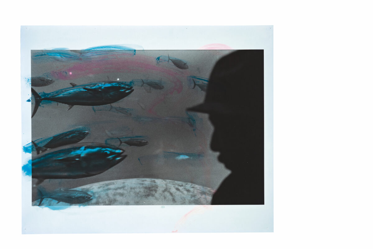
Obsession is carried out to the limits in both content and production in Prestel’s enthralling entry into Masahisa Fukase’s archive. Again, we find that the art the Japanese photographer produced towards the tail-end of his working life bears an intense and burning experimentalism that surpasses even his greatest opus. Private Scenes is off the charts brilliant, with its wild and enticing cover, glossy black pages and cinematic format through which we enter Fukase’s inner-theatre. It brings together “Letters from Journeys” – consisting mostly of Fukase’s street “selfies” taken across Europe and India in 1989 – and the more sprawling “Private Scenes ’92”. Uninhibitedly brush-stroked with colourful inks, the latter offers an amped-up and fevered tenor to Fukase’s mundane, sometimes surreal, street scenes. Each feels world-containing, condensing elements of documentary, performance and autobiography, with the artist an ever-lurking, unresolvable shadow-presence. Not only does this title contribute new insights into Fukase’s eccentric ways of seeing, but adds a new dimension to his boundary-pushing ideas around subject and object. Indeed, few artists have so ingeniously lent expression to the medium-old cliché that you photograph yourself in the other. 

2. Chloé Jafé, SAKASA
the(M) éditions and IBASHO

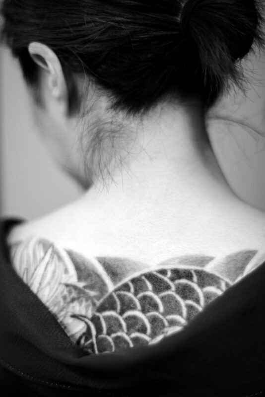
Up until now, the books which make up Chloé Jafé’s trilogy have only been available in pricy limited editions, so this trade release is very much welcomed, not least for the fact it will, in turn, broaden the audience for, and appreciation of, this most creative and tenacious documentary photographer. SAKASA – which appropriately translates to ‘upside down’ – consists of three extremely elegant titles in which Jafé narrates her experiences across the Japanese archipelago, photographing, respectively, the women of Yakuza, the shadows of Okinawa and the fallen of Osaka. Housed within a stunning slipcase embossed by a black dragon, they stand shoulder to shoulder as technically accomplished and ambitious works. Through a mix of photography, hand-written notes, diary entries and ephemera, Jafé seamlessly stitches together underworlds, but in a way that is ambiguous and incomplete, implying events which unfold between the pages. Continuously feeling out the fine line between outsider and interloper, Jafé situates collaboration at the centre of her practice, seeking to stimulate and interweave the contributions of her subjects to constitute a common narrative. Jafé was clearly always in it for the long haul, so it is fitting that the(M) éditions and IBASHO have taken no shortcuts in their production of her very special project.

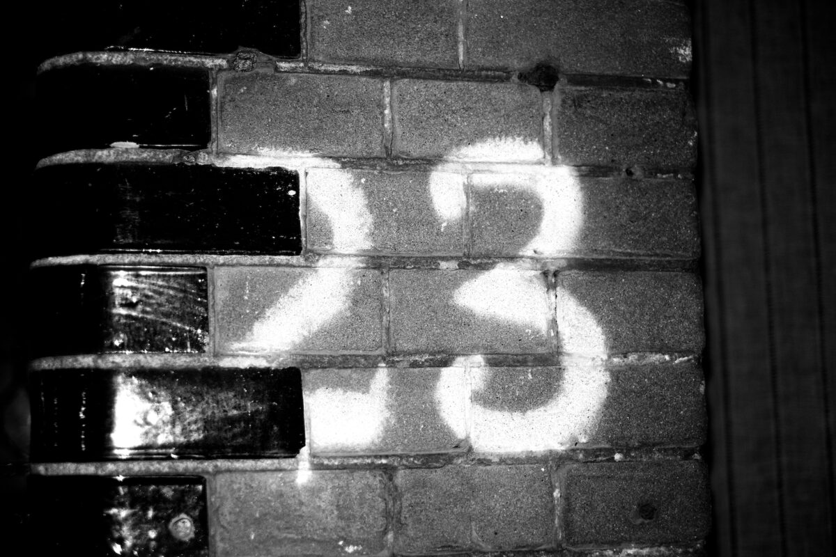
3. Tommaso Protti, Terra Vermelha
Void

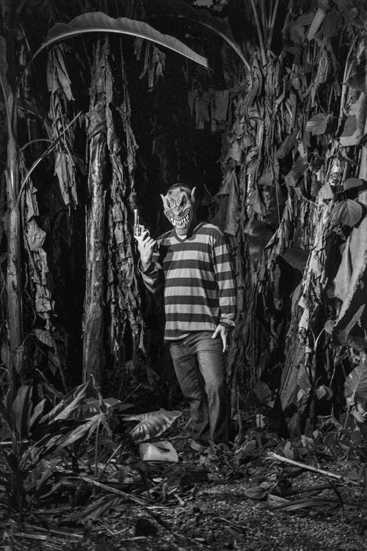
The opening of Tommaso Protti’s remarkable book, Terra Vermelha, invokes a sense of saudade, depicting dystopic scenes from the end of the world. This is the Brazilian Amazon today, where indigenous communities are fighting for survival in the face of rampant deforestation. What follows is a dense, disorientating and elliptical reportage that riddles through a conflict-stricken hinterland, unravelling – in the dead of night – stories about savage land-grabs, forest fires and brutal gang murders. Humanitarian crises intersect and confound; forthright and full-bleed, Protti’s photographs demand our undivided attention in order that we can even begin to understand what we are looking at, not to mention what is at stake. The book culminates with a reflexive reference to the photojournalistic thrust of Protti’s practice, with mocked-up newspaper clippings collaged to captivating effect. Lending context to his otherwise captionless photographs, they bring home the harrowing realities and wrought complexities of the rainforest. Needless to say, few publishers could have taken us into the Amazon’s heart of chaos as nightmarishly as Void have.

4. Jungjin Lee, Voice
Nazraeli Press

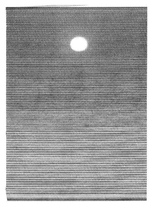
Jungjin Lee’s sublime, immersive and utterly hypnotic entry begins with Pablo Neruda’s ‘La poesía’, in which the poet recalls the night his craft called out to him, amongst raging fires, without a face. This epiphanic image propels Voice, which is, at its core, a meditation on making, resolving and speaking to things. Lee has divided her large-scale book into four stanza-like sections which are punctuated by black spreads. Whilst each is not easily thematised, throughout one finds the alliteration of forms, which spin out stories of the desert – as concept and idea. This is not the first time Nazraeli Press have done exacting justice to the lush materiality of Lee’s photographs, rendered here in quadratones. Collectively, they absent themselves from context; unburdened by identifiable landscapes or linear narrative, they are beholden to no time or place but their own. And even where there is emptiness – stretching sands and lost horizons — there are storms of grain, of noise. Herein lies this book’s transcendent power: transforming landscapes and photographic effects into an aural, bodily and spiritual experience which pierces us with infinite emotional textures, and voices.

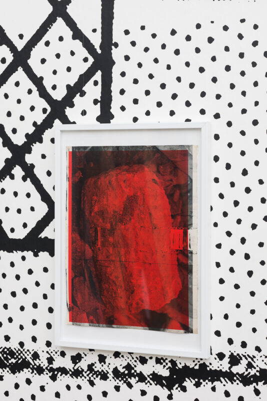
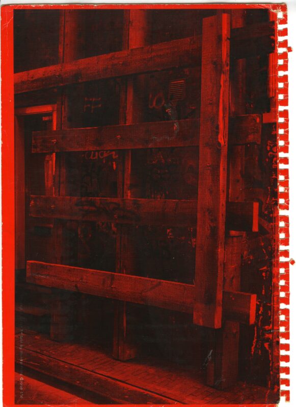
5. Robert Cumming, Very Pictorial Conceptual Art
Stanley/Barker

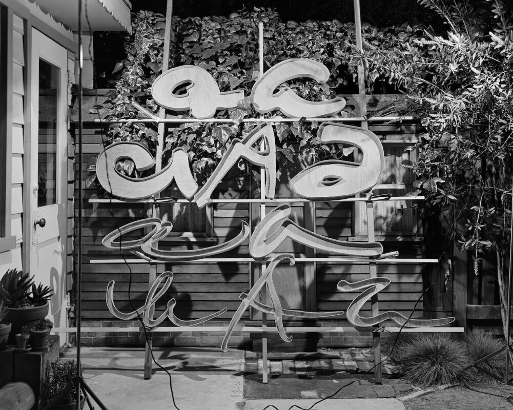
Out with Stanley/Barker, Very Pictorial Conceptual Art is both enlightened and enlightening, building significantly on Aperture’s earlier entry into the astonishing archive of Robert Cumming. The body of work the late American artist produced in the 1970s – the decade he settled on, and began his serious engagement with, photography – has been savvily composed by editor David Campany, whose essay makes the convincing case for Cumming’s range and daring experimentation with the medium that was well ahead of its time. Repetition is employed throughout this handsome book, with its gatefolds filled with multiple views of the same subject-objects, revealing the unique ways Cumming looked, thought and sketched with his large-format camera. Entered swiftly together, one finds that you can always stumble upon something new or intriguing, even if Cumming’s camera models, motorised shark or “0 + 0 = 0” donut equation deliberately defy any utilitarian function. Whether these are images of elements of sculpture or the artist’s idea of sculpture might be beside the point. Let us revel in the incisive eye of Cumming the beholder.

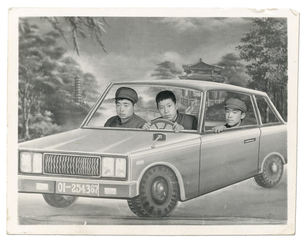
6. Ruben Lundgren, Dream Machine
Jiazazhi

This marvellous and amusing album tells the story of China’s craving for the new through a very specific sub-genre of 20th century studio portrait photography. As testified by Ruben Lungdren’s Dream Machine  and contra to popular assumptions – ordinary Chinese folk up and down the country embraced “exotic” commodities, including the automobiles and aeroplanes – or gas-guzzling “fart-carts” – that appear in these pictures as kitschy cardboard cut-outs. One can only imagine how painstaking Lungren’s research was in order to source these gems, which fundamentally speak to the power of seeing as not only dreaming, but believing. Jiazazhi’s design is simply delightful, from the spiral-binding which lends a scrapbook feel to the windows which invoke the sensation of entering other worlds, new worlds. And, yet, the old world remains an ever-present too, with quaint visions of the banks of the West Lake embroidered on the cloth cover, details of which are scattered throughout the pages, reverberating in the imaginary. This is a book of rare quality; a real labour of love by Lundgren.

7. Bindi Vora, Mountain of Salt
Perimeter Editions

Another noteworthy vernacular contribution comes from Bindi Vora, whose lyrical pandemic piece winds up as a cacophonous reflection on recent times. Published by Perimeter Editions, Mountain of Salt is small but densely layered, containing hundreds of cleverly juxtaposed archival photographs in concert with appropriated buzz-phrases, idioms, jokes and pledges which the artist pulled from news articles, press conferences and social media in the wake of Brexit and the Black Lives Matter protests. The loose intercourse of text and image delivers a series of thought-provoking moments and emotional triggers, accumulatively resonating for the ways in which eras are formed and form us, both subconsciously and violently. Whilst the digitally overlaid shapes are light and subtle interventions, they do just enough to disturb the syntax of the images, making history peculiar and alive. Vora’s is one of those books that feels both specific and sweeping at the same time; her era-encapsulating vision of a spectred isle.

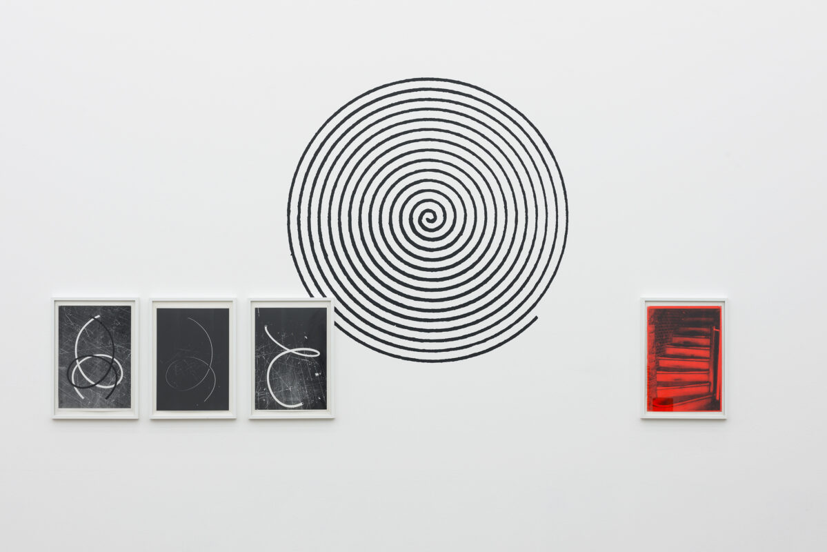
8. Tarrah Krajnak, RePose
Fw:Books

On making history aliveRePose, Tarrah Krajnak’s deft and deceptively powerful conceptual work with Fw:Books also deserves a mention. The title presents a typology of poses by women, (re)performed by the artist – on-site and in real-time – from her personal collection of printed matter, ranging from fashion catalogues and art history books to vintage pornographic magazines and anthropological studies, even if they are never indexed here. Whilst the female body in art has historically been mute and functioned almost exclusively as a mirror of masculine desire, Krajnak inhabits the body as a visual territory, to be both critiqued and claimed. These are not so much reappropriations of poses, but, rather, reoriginations of them, with Krajnak’s cable release serving as a kind of umbilical cord which connects her to other images, other women. Although this book is stripped-back and modest in its production, it nevertheless possesses an immediate aesthetic charge, conveying the flickering intensity of a flipbook. The pages unfold and map out a literal lineage, through which Krajnak dances like a ‘snaking aggregate’, as is articulated most beautifully in the accompanying essay by Justine Kurland, who is herself no stranger to archival animations.

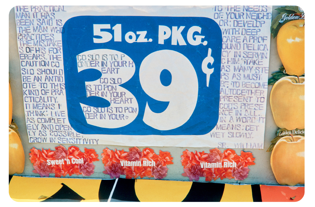
9. Corita Kent, Ordinary Things Will Be Signs for Us
J&L Books and Magic Hour Press

One of the great discoveries of the year has come courtesy of J&L Books and Magic Hour Press, who have, in Ordinary Things Will Be Signs for Us, condensed Corita Kent’s vast trove of source slides into a graphically bold and joyful book which offers a new context to the revolutionary screen prints for which the former nun is known. Immaculately reproduced by Jason Fulford with rounded corners and a real care for colour, the jam-packed visual combinations – laid out innovatively and unpredictably – have the sister singing her way through 1960s Los Angeles, from its vernacular surfaces – a bricolage of street signs, billboards and supermarket produce – to the classrooms of the covenant where Kent taught art. What is most commendable about the edit is how it does not impose a narrative on behalf of the artist, but, instead, channels the spirit of this multi-levelled visionary and her uncanny ability to find meaning in all things modern. Whilst Kent’s language of photography might not bear the explicitly world-changing mission of her language of Pop, what it does teach us, or remind us, is how we see things not as they are, but we are.

10. Lin Zhipeng, Skinny Wave
Same Paper

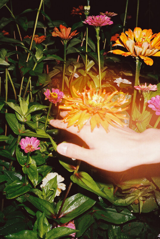
With each new book, Lin Zhipeng, the Chinese photographer who goes by the name of “223”, distinguishes himself as an increasingly important voice within contemporary photography, and his latest is certainly a leap forward in terms of sophistication and subtlety. Assembled from the small aide-mémoires Zhipeng has collected on the road over the past 20 years, Skinny Wave proposes a B-side to the pop seduction for which the photographer is most celebrated, yet nevertheless retains his trademark blend of classical serenity and ornamental playfulness. It is clear that for Zhipeng, where there is beauty, there is a picture: a blossomed flower, a boy paddling in a stream, a split fruit. Same Paper’s intelligent design does well to enhance the book’s haptic dimensions – not to mention its onion-like layers of meaning – with its scratch-marked cover (which is actually one of four), heavily saturated pages and expansive gatefolds, whose shifts in attention subconsciously seep us into the memories of Zhipeng. Here is an artist who calls for a quiet, contemplative moment with photography; an intimacy that can only be bestowed by a book.♦


Alessandro Merola is Assistant Editor at 1000 Words. 

Images:

1-Cover of Masahisa Fukase, Private Scenes (Prestel, 2023). Courtesy of Prestel and Masahisa Fukase Archive.

2-From ‘Private Scenes ’92’ (1991–92) in Masahisa Fukase, Private Scenes (Prestel, 2023). Courtesy of Prestel and Masahisa Fukase Archives.

3-‘Jun with her kimono’ (2016) from Chloé Jafé, SAKASA (the(M) éditions and IBASHO, 2023). Courtesy of the artist, the(M) éditions and IBASHO.

4-‘Manaus’ (2017) from Tommaso Protti, Terra Vermelha (Void, 2023). Courtesy of the artist and Void.

5-‘#29’ (2019) from Jungjin Lee, Voice (Nazraeli Press, 2023). Courtesy of Howard Greenberg Gallery.

6-‘10 Unique Article A’s’ (1975) from Robert Cumming, Very Pictorial Conceptual Art (Stanley/Barker, 2023). Courtesy of The Robert Cumming Archive.

7-‘Untitled’ (c. 1980s) from Ruben Lundgren, Dream Machine (Jiazazhi, 2023). Courtesy of the author.

8-‘Quarantine is a stunt, they could be playing golf’ (2020–21) from Bindi Vora, Mountain of Salt (Perimeter Editions). Courtesy of the artist.

9-From Tarrah Krajnak, RePose (Fw:Books, 2023). Courtesy of the artist.

10-From Corita Kent, Ordinary Things Will Be Signs for Us (J&L Books and Magic Hour Press, 2023). Courtesy of Corita Art Center.

11-‘We have no purity in the night’ (2021) from Lin Zhipeng, Skinny Wave (Same Paper, 2023). Courtesy of the artist and Same Paper.

Stephan Keppel

Hard Copies

Essay by Taco Hidde Bakker

Taco Hidde Bakker reflects on his recent curation of Stephan Keppel’s Hard Copies at Camera Austria, Graz, a parallel book and exhibition project characterised by the entanglement of the material appearance of (things in) cities, ways of picture-making and arrangements of images and found objects.


“Who is the master and who is the copy?” turned out to be the crucial question when the Dutch artist Stephan Keppel and I finished our preparations – including multiple calls to discuss our plans to build a physical scale model – for Keppel’s first-ever international solo exhibition, at Camera Austria, Graz. After more than one year of multiple lockdowns and an ever-deepening screen-dependence (pulled toward them like moths), this question seemed more pertinent than ever. It is also an underlying theme in Keppel’s work produced over the last decade, where in recent years he experiments with physical objects placed within the vicinity of their variously Keppelesque representations. Ultimately, what we wished to achieve in our exhibition was an interplay of visual correspondences within a wide selection of many different works made and printed (and collected) by Keppel from the point his “city series” began. Since 2011, Keppel has published four books dedicated to as many cities: Den Helder, Paris, New York and Amsterdam.

For the artist and curator arriving into Graz, as outsiders, my wish was for Keppel, who never visited Graz previously, to see it beforehand and possibly include new works in the exhibition. The idea was that this fresh encounter would result in the artist’s idiosyncratic processes of scanning, printing and reprinting. In a four-week frenzy in May, Keppel processed several images that he had captured in late April. One experiment with an image showing the word “ZIMMER” (“ROOM”) on a façade led to the provisional title of what might become a new city book or booklet: Immer Zimmer (Always Room). In the exhibition, we managed to weave the many facets of Keppel’s urban reflections together in a playful yet reserved manner. Some curatorial anchors worked-up in the scale models materialised wonderfully, while we also left ample room for improvisation. I take it as compliment that many visitors thought that things were done on purpose whereas in actual fact they were gifts, such as the rhythmic reflection of the light tubes in the four vitrine tables showing books, reference materials, (test) prints and found objects.

Stephan Keppel’s four photo/graphic books attest to an incisive exploration of the relations between built environment, image and book. In Keppel’s books and spatial presentations, there is an entanglement of the material appearance of (things in) cities, ways of picture-making, arrangement of images and found objects. The working process of his books published so far swings between cycles of taking photographs, appropriating image files, printing the files using (often discarded) printers, rescanning and reprinting. This results in idiosyncratic, oftentimes abstracted images with material qualities that are interwoven with the material surfaces of the built world to which these images also refer. There arises visual tensions between the image as image and the image as a window onto something beyond its own.

The tone was set with Reprinting the City (2012) on the small Dutch city of Den Helder. It is the first of the four books that Keppel laid out and edited in collaboration with the designer-publisher Hans Gremmen from Fw:Books. The book is A4 – the default copying paper format – and the following three books keep to this size. It can be read as a stack of documents against the grain (the mode is more medium-focused than documentary). In the cover image, a dotted halftone screen overrules an image of calm waves on the ocean’s surface. A black stripe emerges from an out-of-sync double printing of the same motif, overlaid at the edges. Discarded objects figure prominently, including DVD players, disk drives and record players. The thrift store and street are pleasure grounds for Keppel’s eyes. He is a ‘street comber’ according to the artist Roeland Zijlstra. The comber is normally someone who combs the beaches for treasures that might have washed ashore. Zijlstra furthermore notices that Keppel’s way of rendering discarded objects means that ‘he removes from the remainders of life the sadness that adheres to them and he exposes an underlying character – tender robust radiant intimate.’

A key feature of Keppel’s practice is that it is recursive. Already in Reprinting the City, there are several indicators of a recursiveness that becomes much more pronounced in later works. There are photographs of prints lying on the floor, their edges curling up, and photographs showing images (misprints perhaps) that might appear elsewhere, too. There is a flat file cabinet placed on its side, and a playing with halftone screens. In the dream-like Entre Entree (2014), Keppel took these experiments a step further. He stayed in Paris on two residencies for a full year, at the Van Doesburghuis in Meudon-Val-Fleury, a studio-living space designed by Theo van Doesburg in the 1920s, and at the Atelier Holsboer in the Cité des Arts. Keppel circled around the city’s busy Boulevard périphérique, and explored the city’s outskirts. Façades of postwar modernist or brutalist buildings, entrances, doors, marble and the occasional exotic plant feature prominently. Paris offered a new passage into Keppel’s world of strolling, picturing, scanning, printing, reprinting and of photographing studio settings.

Keppel honoured the city he spent the least time in (physically) with the heaviest tome, Flat Finish (2017). “It is so New York,” said the photographer Ken Schles. The city wears differently than Paris; it is much more unruly in its architecture, despite the solid grid structure of its layout and the ever-polished “renewal” taking place in a Manhattan ruled by speculative flash capitalists. Keppel’s an-iconic vision of New York is far removed from any tourist guide. When the Empire State Building comes into view, it is a heavily pixelated dilution from tweeted pictures. The second-handedness of the city comes to the fore here. Keppel scanned the websites of sellers of reused building material before going to New York, examining the archives of the Canadian Centre for Architecture in Montreal beforehand. Upon arriving, he already had a focus on the recycling of the city which eternally rebuilds itself. Of course, this once again looped back into Keppel’s own practice of circling and recycling. As the artist and writer Adam Bell remarked in a review in the Brooklyn Rail in 2018: ‘[Keppel’s] repurposed images function as building blocks for [his] own metropolis while also pointing to the regenerative and iterative process of both the built world and Keppel’s image-making.’

Keppel appropriates the cities that have become the locus of his books (the city mostly being a geographic limitation determining the working terrain for a certain period of time) and adapts them to the iterative processes of his printing obsessions. How would the city of Amsterdam, which he adopted as his home, be incorporated into his image world? The fourth “city symphony” is the most elaborate to date. With each new book, the domain expanded with regard to image types and sources to be included. While in the earlier books only the exceptionally well-versed city expert would recognise the images’ origins, in his new book Keppel included detailed notes about his sources in a type of coda. Keppel’s eye for intriguing details is contagious. Details that nearly everybody rushing from A to B would not notice become monumental in Soft Copy Hard Copy (2021): visible are hand-painted numbers from World War II, flattened house numbers from the days of the Amsterdam School building style, tape marks on the sidewalk and concrete cylinder leftovers from public construction works. Here, Keppel weaves many more strands together, from his minute photographic observation of architectural details or of prints in flat file cabinets to various found “readymades” in the streets or even found diapositive slides originally belonging to the Stedelijk Museum, showing artworks from their collection by artists such as Jackson Pollock, Piet Mondriaan and Joel Shapiro. There is a page scanned from the novel An Evening in Amsterdam (1971) by K. Schippers. This author is an astute observer, too, with a keen eye for unattended details and the serendipitous: ‘Sometimes the curb is just a sidewalk tile, situated vertically, or a brick, placed on its side. Never similar, always a difference of levels. Never connected perfectly, curbs. See, there’s a crack between these zig-zag shapes that were meant to connect them tightly.’♦

This essay is adapted by
Taco Hidde Bakker from his text “Cities of Thrift and Ink” accompanying the exhibition Hard Copies at Camera Austria, Graz, until 15 August 2021.

All images courtesy the artist and Camera Austria, Graz © Stephan Keppel

Installation views of Hard Copies at Camera Austria, Graz. Photographs by Markus Krottendorfer


Taco Hidde Bakker is a writer, teacher, translator and curator in the field of the arts, specialising in photography. He studied at two art schools before obtaining an MA in Photographic Studies at Leiden University. He has contributed his writing to numerous artists’ books, catalogues and magazines, including Camera Austria International, Foam Magazine, British Journal of Photography and TRIGGER. Bakker is the author of the text collection The Photograph That Took the Place of a Mountain (Fw:Books, 2018). He teaches Theory at the Utrecht University of the Arts.

Images:

1>9- Installation view of Hard Copies at Camera Austria, Graz, 2021. Photograph by Markus Krottendorfer.

10-Studio view Tonerprint, from the series Soft Copy Hard Copy (Amsterdam), 2021.

11-Stephan Keppel, ‘Painted house numbers from World War II’, from the series Soft Copy Hard Copy (Amsterdam), 2021.

12-
Stephan Keppel, ‘Spuistraat 22’, from the series Soft Copy Hard Copy (Amsterdam), 2020.

13>15-
Stephan Keppel, from the series Reprinting the City (Den Helder), 2012.

16-Stephan Keppel, ‘Les Plantes Pantone’ (Paris), 2014.

17-
Stephan Keppel, from the series Entre Entree (Paris), 2014.

18-
Stephan Keppel, ‘Unibeton II Paris’, from the series Entre Entree (Paris), 2014.

Michael Ashkin

Were it not for

Book review by Eugénie Shinkle

In the desert, the traces of human presence are visible on the ground for a long time. Alongside the remains of earlier inhabitants are other, more recent legacies –– accidental landscapes of exhausted ground, tracked and paved over, sown with garbage, shattered and heaped up. Created by obscure acts of violence, places such as these seem to exist below the horizon of sense, their dialect both familiar and unreadable.

Between 2014 and 2017, Michael Ashkin made a series of visits to the American West, covering a vast circle with the Mojave Desert at its centre – Phoenix, Las Vegas, Lake Mead, Death Valley, the Imperial Valley, Lake Havasu, the Salton Sea, Palm Springs, Edwards Air Force Base, California City, the San Diego suburbs, and the US/Mexico border near Calexico. These are the scaled-up, hubristic landscapes of manifest destiny, built on the back of monumental successes and equally epic failures, potent embodiments of the sense of possibility that defines what it means to be American. But Ashkin saw these places differently, as anxious expressions of a society in which “violence is regularly enacted in the most mundane moments and places according to rules and intersections of forces that are not always apparent”.

Were it not for published by FW: Books is a dark book. It documents shallow histories, disposable geologies of plastic and cardboard and used-up commodities. It is an elegy for a landscape shaped by cumulative minor desecrations, inevitable outcomes of the violence that inheres in casual acts of consumption: “how we decide to use and value objects, how we exploit them, own, possess and dispense with them, how we tell their history, interact with them unthinkingly and often quite cheerfully, and how we ultimately describe them and think about them within the limits of our language.” For Ashkin, these anonymous spaces, and the debris that is spread over them, are the nuclei around which the existential dread of a nation is crystallised.

Ashkin’s photographs are neither easy nor beautiful. Displayed in a roughly chronological order, they consist mostly of exterior shots of unnamed places: vacant lots, empty ground, roadsides. Their form and subject matter are repetitive: rubbled foregrounds, fences and barriers, blank walls, dumped trash, blocked horizons, the characterless oblongs of low-rise architecture. Occasionally, we glimpse an empty office set behind dusty plate glass; they have the air of places where some kind of force is administered. Sometimes, between one frame and the next, the camera shifts slightly, moving in closer, revealing things that were obscured by other things, but providing no new information. The unease in Ashkin’s pictures has a blunt, simmering quality that courses slowly through the body like an infection.

It would be tempting to describe Ashkin’s photographs as landscapes if everything about them didn’t resist this definition. They are neither natural nor scenic; they contain neither a hint of promise nor a shred of redemption. What’s most remarkable about these images is their almost total vacuity: overfilled with visual information but somehow devoid of content. Ashkin shoots in landscape format but crops his images to portrait – itself a kind of violence, a repeated violation of the order of landscape and the perspectival logic of the photographic frame. Every picture is haunted by this missing information – ghosts of what the camera saw, the phantom limbs of rational space.

Running through the images are 680 lines of anaphoric verse. Some are stacked up in thick columns, others are randomly assigned as captions to individual images, a few sit alone on otherwise blank pages. Writing in the dark, during periods of insomnia, Ashkin composed the text in the lightless middle ground between wakefulness and sleep – a liminal space echoed in the text itself: “I imagined what could exist between the writing subject and what lay beyond the distant mountains.” Composed some years before the photographs were taken, the text has no direct relationship to them. Its logic is not that of the caption; instead, it follows the prosodic order of the incantation or psalm. It runs through the work like the drone of an invisible machine, measured and deeply evocative, a slow-flowing index of pasts and presents, events and states of being, familiar images and strange mutations. We like to imagine language as a scaffold for the image; a way of creating meaning when the photograph gives us none. But Ashkin’s words follow their own strange order: “In the end, the phrases amount to a list of how the status quo reinforces itself, how inertia is maintained.” Here, the repetitive sequence of the anaphora is the steady rhythm of nothing happening.

Were it not for takes as its subject the unfocused middle ground of history; places with no identifiable past or future and a drab, leaden present. Territories not unlike these were staked out in the 1970s by photographers like Lewis Baltz and Robert Adams, early on in a process of recognition that jolted the idea of landscape out of the orbit of human living and into the deep, cold-blooded space of capital. The topographies of waste in Ashkin’s photographs are the end game of this process. And if the places that Baltz and Adams photographed were understood as abstractions – space deployed as a commodity by the machinery of advanced capitalism ­– the places that Ashkin photographs are abstractions made real.

‘When we pay attention to the world, I believe we have to admit that it is a fearful place down to its smallest details,’ remarks Ashkin. Were it not for is a catalogue of such details – a procession of negations and refusals that mirrors the working of capital itself. There is a certain satisfaction in unlocking the conceptual schema of the work – understanding it not simply as a document of disorder but a disordered document with transgression built into it: a refusal of rational space, of narrative time, of customary perception. Others encounter the work differently. Ashkin showed the book to a class of medium-security prisoners at Cayuga Correctional Center in New York State: “They were very interested in its logic. One prisoner (about to be deported back to Honduras) had migrated across the desert border and he said the book described the world as he understood it.” There’s not much in the way of conventional aesthetic pleasure to be had from Were it not for. What it offers instead is a blunt enactment of capital’s own corrupt devices – for some, an intellectual privilege, for others, a lived reality.

All images courtesy the artist and FW: Books. © Michael Ashkin


Eugénie Shinkle is a photographer, writer, and Reader in Photography at the University of Westminster. She writes for various publications such as Foam, Aperture, Fashion Theory, American Suburb X, and The Journal of Architecture. Recent work includes Fashion Photography: the Story in 180 Pictures (Aperture/Thames & Hudson 2017) and ‘Painting, Photography, Photographs: George Shaw’s Landscapes’, in George Shaw: A Corner of a Foreign Field (Yale University Press 2018).