


Dreamtime:
Wolfgang Tillmans’ EU posters
Essay by Daniel C Blight
The modern poster, like photography, was a product of the age of mechanical reproduction. Alois Senefelder’s invention of lithography in 1798 instigated the almost one-hundred-year development of the poster printing press, up to a crucial stage in the 1880s when the ‘three stone’ lithographic process developed by Jules Chéret allowed for quicker and more colourful printing. From this point forward, the photographic image and the poster simultaneously became a ubiquitous method for precise communication – at once the mouthpiece of the state, a means for commercial advertisements, public events promotion and political propaganda. The form is pervasive and persuasive in equal measure.
The poster is also a medium that demonstrates consistent artistic ingenuity. From Toulouse-Lautrec’s Belle Epoque period design for Joseph Oller’s cabaret Moulin Rouge in 1891, to turn of the century German Plakatstil – ‘poster style’ – which saw poster design reject unnecessary embellishment in favour of flat shapes, simplified colourings and increasingly abstract forms. After the First World War the ornamental stylings perpetuated by Art Noveau in Europe would continue to be replaced by progressively geometric and streamlined forms, as seen diversely in familiar art movements including Cubism, Futurism and Surrealism. Importantly, after the Second World War, the prominence of the poster would diminish as people turned to television and magazines for entertainment. It was the Swiss Style of graphic design that made significant contributions to the identity of the poster in the period from the late 1940s leading up to the advent of postmodernism. Designers such as Armin Hofmann, Hans Neuberg and Jorg Hamburger developed mid-century designs for commercial contexts, characterised by grids for the precise layout of typographic and photographic elements, as visual fastidiousness and order prevailed.
Alongside the history of poster design’s visual developments, politics also played an integral role, perhaps most famously articulated by Russian Constructivist design in the 1920s, but also later in the work of the French group Atelier Populaire during the 1960s. It is in the political context that the social importance of the poster is key.
The poster preceded the arrival of the newspaper, as Josef and Shizuko Müller-Brockmann tell us in their 1971 study History of the Poster. Historically, the poster and the newspaper were for a time the same thing. Acta Durna, or ‘daily act’, the earliest form of stone tablet posted around the streets of Ancient Rome publicised official state news. A Roman expression accompanied these posters – “make public and propagate” – an apt description of the act of posting sustained right up to the present day. In this sense, the three ideas of ‘the public’, ‘postering’ and ‘propagation’ could be seen as correlative. Posters are messages to be widely communicated in public space. Public space, as Henri Lefebvre has it, “upholds a measure of democracy”. In its most hopeful state, then, the poster could be seen as functioning in relationship to democracy, as a declaration of the possibility for all voices to be equally heard. This is the political potential of the poster, and we need it most in times of uncertainty – when democracy is on the wane. In these times, posters must attempt to communicate to as many people as possible.
The very identity of democracy is under prominent discussion with regard to the United Kingdom’s relationship to the European Union following the British public’s vote to Leave, and the poster has returned full force. Nigel Farage’s anti-immigrant abhorrence – reported to the police for its fascist overtones – puts politics front and center in a parallel, crass and violent history of the poster. Be it tethered to terra firma, or meme-like on an Instagram account, the poster remains inextricably linked to democracy, either by way of standing for it, against it, or by trying and failing to stand for anything at all.
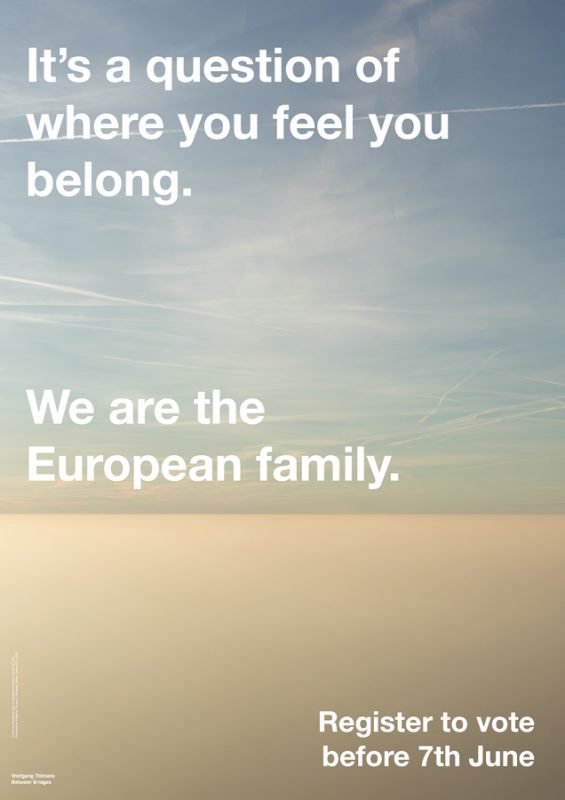
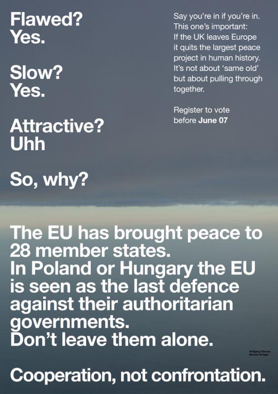
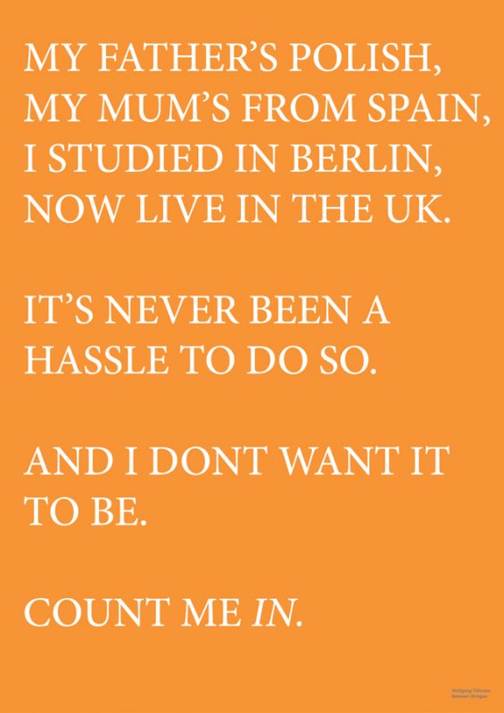
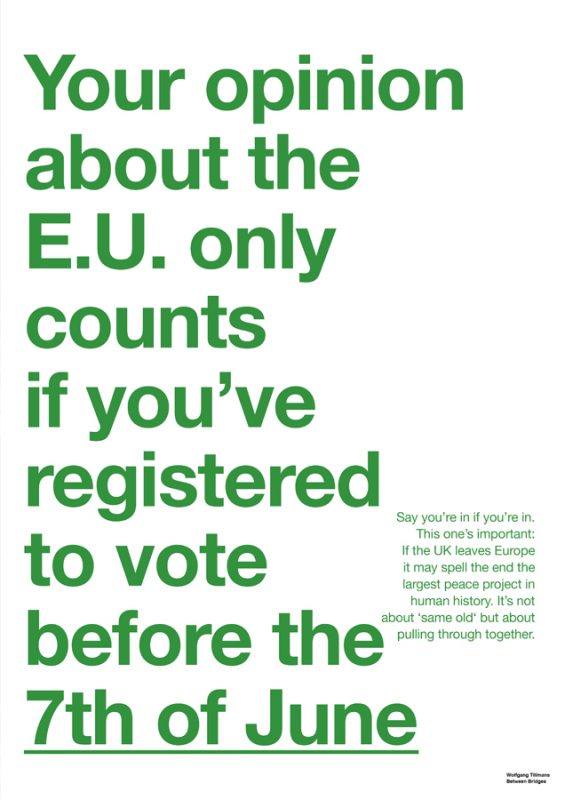
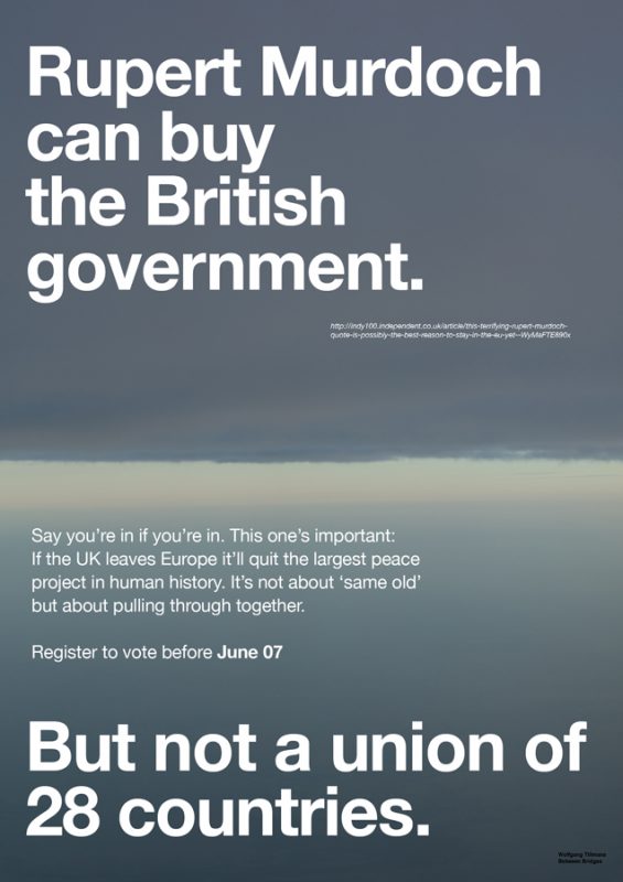
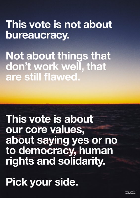
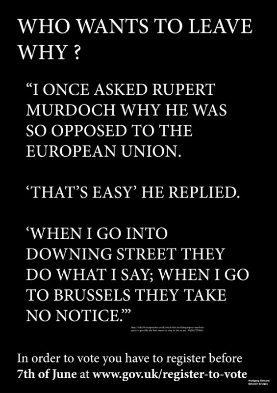
In support of democracy and EU membership, Wolfgang Tillmans’ posters strangely reflect Pan Am airways’ Helvetica poster campaign of 1971 (evocatively referred to as Dreamtime in 2009 by writer Frederico Duarte), designed at the studio of Chermayeff & Geismar (C&G) and produced the same year that Müller-Brockmann’s The History of the Poster hit the press. Pan Am’s posters made the MoMA New York’s collection the following year – purportedly acquired by curator Mildred Constantine – but it seems unlikely the same fate will befall Tillmans’ effort. Like Pan Am’s then expensive and exclusive planes intercontinentally travelled, Tillmans’ posters made movements all around the moderate arty Left’s niche corner of the internet – on Facebook, Instagram and Twitter – proclaiming the visual identity of some vague ‘art world solidarity movement’ by reducing it to the irriguous trend of the colour gradient, or a sense of empty poetry rendered in the visual platitudes of the sea, the horizon and the coastline. Similar to Pan Am’s corporate Dreamtime, the imagery of infinite beauty and romantic extrication is evoked by Tillmans in the name of democracy, and in relation to the dreamlike allure of the natural landscape. The poster images derive from the artist’s own work, which too often finds itself in that vague expanse between the percipient and the uninspired. This is Tillmans’ attempt to do everything, as Michael Bracewell states in the title of his 2010 essay on the artist, ‘everywhere, all the time and at once’. Photography, in the most democratic sense, can do everything, but it rarely succeeds to do anything when it does.
If both air travel and EU membership are about freedom of movement, we have to ask who gets to travel where and how? In the same way that Pan Am’s Dreamtime spoke to those that can afford the freedom of air travel, Tillmans’ EU poster campaign communicates to those in the networked art world who possess the education, social standing and cultural capital to buy in to the vision the designs promote – simply because hardly anyone else gets to see them. Where it was taken up elsewhere, as was the case on Richard Branson’s social media, it was too easily appropriated by the friendly face of consumer capitalism. This is the political failure of Tillmans’ posters. This is where, to refer again to the historical identity of the poster, aesthetics overshadows real and effective political intervention – a somewhat vacant promise of hope to come, then. Posters always sell something, be it air travel or EU membership, but what do posters do, when they do nothing at all? When they preach to the converted? In such circumstances, political struggle becomes static, defunct.
The European Union is rotten from the inside out. A general observation of its turn from undemocratic to distinctly antidemocratic tells us this: the unelected and unaccountable members of the European Commission; the public-corporate sector nepotism in respect to the disproportionate promotion of big business over small; the centrally encouraged privatisation of state-run services to “develop growth and competition” which has resulted in austerity and a decrease in wages and living standards Europe-wide. Not to overlook the pecuniary authoritarianism – deflation, stagnation, lack of market competitiveness and the rise of fascism and bigotry. Indeed, the policies of the EU render it “imperialism without empires” – to cite Hugo Radice – and have effects that stretch far beyond the bounds of Europe itself. The current migration crisis and the manner in which it has revealed racist and close-minded attitudes across the continent towards people of colour in desperate need, is just one example.
I voted Remain not because I like the EU, but because the best thing to do in the build up to the referendum was to promote the Remain campaign and vote accordingly for there is no doubt that the Leave campaign was characterised by xenophobia and racism. This time, one should clearly have voted to stay in, but if the Left were stronger in the UK – if for example there was a socialist government in power – I would have likely voted Leave in order to encourage a certain political distancing from neoliberal policy-making. Now the highly-controversial decision to leave has been made, perhaps there can be a more open conversation about the vast problems with the EU itself, which are explicit, and indeed some of the shortfalls of Tillmans’ campaign which was, frankly, starry-eyed bourgeois propaganda at its best.
There are perhaps three ways to consider Tillmans’ EU poster campaign, both positively but also necessarily from a critical perspective. The social sentiment is there in Tillmans’ accompanying text on his website. This is the pro-democracy nuts and bolts of the campaign. The sort of articulation for solidarity and democracy we can all support, led by an artist willing to use his profile to try and make an impact. This is what renders the endeavour a good idea at first glance. Second, there is the sense of the project appealing to artists and creative types through its visual identity, however typically superficial it may be. Yet, this is where the project comes unstuck, both in terms of to whom it attempts to speak, and the manner in which it uncritically selects its visual metaphors. Third, there is the political meaning of the project and the way in which it seems to visually and textually camouflage the lamentable nature of the EU, in favour of some distracting statements regarding the cultural and political successes of the union. One poster declares, “We are the European family”, while another states “What is lost is lost forever”. Some of the more successful catchlines are overshadowed by these overly trustful messages. If Germany is dad and France mum, why has the last year – to continue the familiar analogy – seen Greece grounded and offered no pudding? Perhaps the Greek child would have been better off in the long-term running away from home? Or perhaps more importantly the metaphor doesn’t work in the slightest? The idea that the EU is united in some unbreakable union of sibling or parental love is naive, and in fact betrays its own original sense of genuine humanitarian togetherness promoted at the time of its formation.
Whatever one thinks of the EU, Tillmans’ campaign failed to speak widely enough – its largely internet or gallery-based sites of display communicating only to those already convinced of the necessity to Remain. As Susan Sontag says of the afterlife of posters that were produced in Cuba during the political struggles of the 1960s, Tillmans’ designs too seem to be “one more item in the cultural smorgasbord provided in affluent bourgeois society.” Furthermore, as the famed Atelier Populaire group reminded us in their Posters of the Revolution (1969) with regard to their own experiences in 1960s Paris: “To use them [posters] for decorative purposes, to display them in bourgeois places of culture or consider them as objects of aesthetic interest is to impair both their function and their effect.” This is disappointingly the case where the posters have been displayed at Maureen Paley, the established East London commercial art gallery that represents Tillmans.
Why stand in support of the EU as a neoliberal project if, as Alfredo Saad-Filho and Deborah Johnston put it in their edited volume Neoliberalism (2005), it “imposes a specific form of social and economic regulation based on the prominence of finance, international elite integration, subordination of the poor in every country and universal compliance with US interests.”? The EU went the wrong way a long time ago, and it will most probably continue to disgustingly contort from the inside out post Brexit. Now that the UK is set to no longer be a member, other EU nations will likely want their own referendums, and as we clearly saw from the example that has been made of Greece in the last year with regard to their bailout negotiations, the EU powers-that-be – the Troika, a dogmatic triumvirate comprised of the European Commission, the European Central Bank and the International Monetary Fund – are not prepared to make concessions or act with any dignity towards those with lesser means. To put it simply, they promote the interests of business and attack the poor.
With these broader considerations in mind, what might Tillmans’ brand of art world propaganda mean in the context of today’s discussions of the European Union, and in turn how do the posters themselves sit within the historical context of art-photography-cum-poster-design as a form of political ‘activism’?
Despite Tillmans’ agreeable sentiment, it seems clear that the campaign – in political terms, which is crucial to the social importance of the poster – found itself mostly resigned to the limited social media circles and private spaces of contemporary art. The three key aspects of the Acta Durna, relating to the aforementioned Roman expression “make public and propagate”, fail to live on in the artist’s work, instead manifesting as a form of socially-exclusive communication where the veracity of the daily act is reduced to the non-committal share or retweet in the bourgeois spaces of network culture. ♦
All images courtesy of the artist and Maureen Paley Gallery. © Wolfgang Tillmans
—
Daniel C. Blight is a writer based in London. He is co-editor of Loose Associations, a periodical on image culture published by The Photographers’ Gallery; visiting tutor in the department of Critical & Historical Studies, Royal College of Art and lecturer in photography at the University of Brighton.