Karla Hiraldo Voleau
Another Love Story
Book review by Anneka French
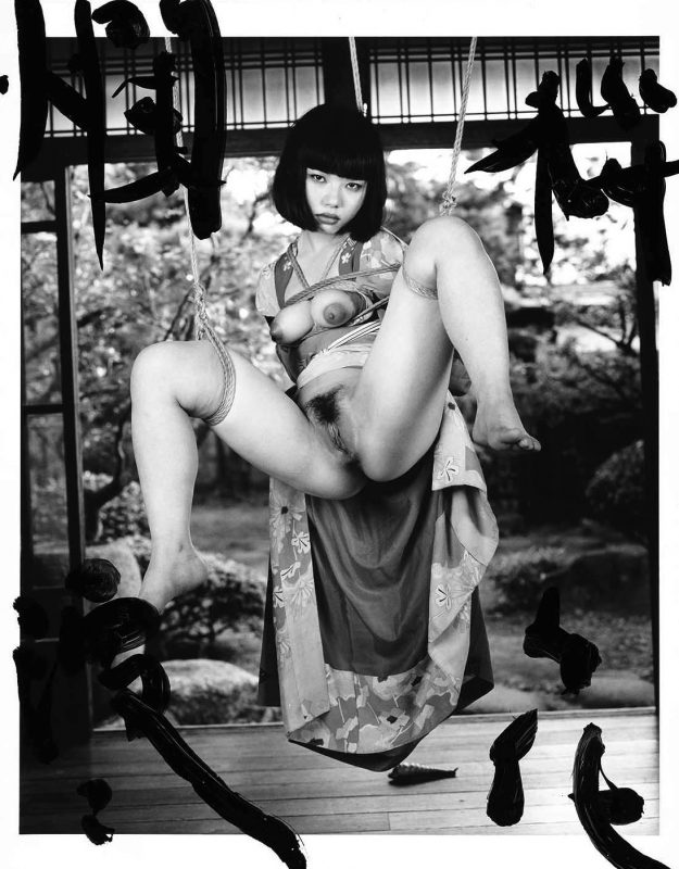
Through a combination of writing, photography and performance, Another Love Story, Karla Hiraldo Voleau’s new photobook with Mörel, re-narrates the final moments of a romantic relationship by casting a similar-looking actor as her ex-lover. Part-fact, part-fiction, the project abounds with emotional and ethical complexity to reclaim the power of her own history whilst also revealing how identity construction can be played out in the digital space, writes Anneka French.
Anneka French | Book review | 10 Jan 2024
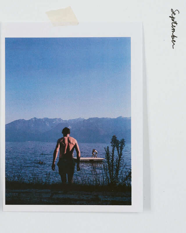
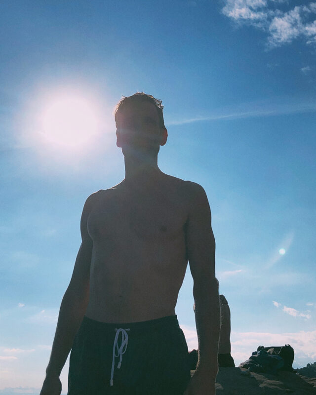
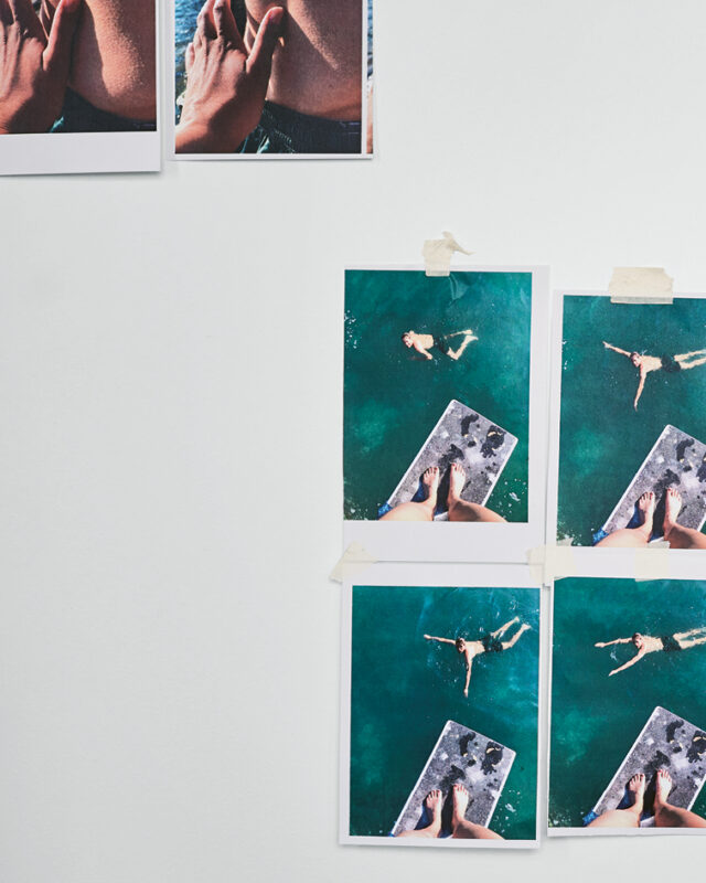
September unfolds through sun-soaked photographs shot lakeside. The sculpted curvature of a man’s back shines wet in the light as he climbs rocks and swims in turquoise waters. There is warm skin, fine hair, touch, seduction. A pair of bare feet seen from above indicate the perspective of the photographer as she looks down upon the man. He winks back up at her.
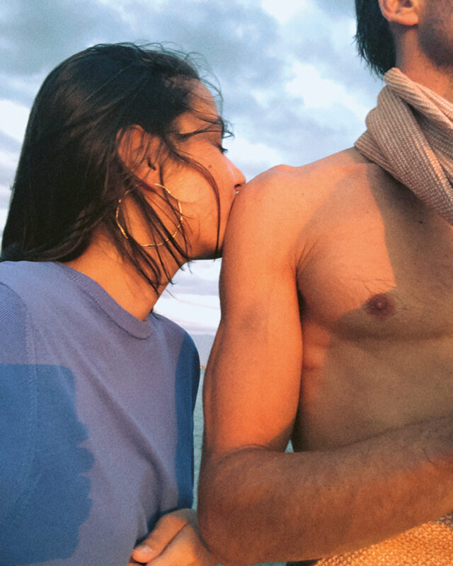
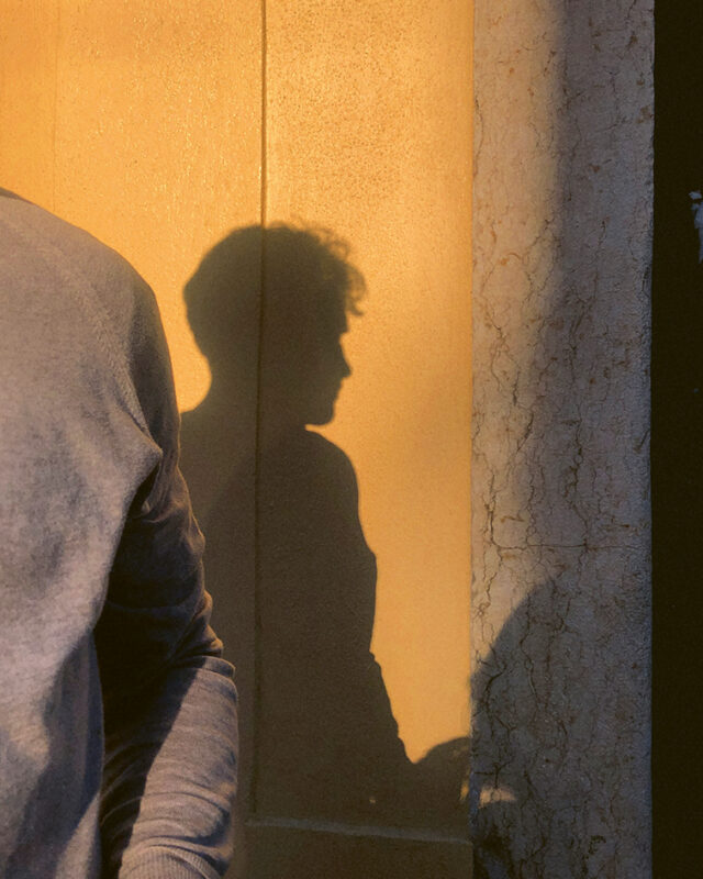
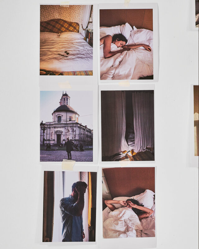
Fast forward to November and glimpses of something amiss might be derived from the inclusion of an image in which the dark-haired man’s shadow throws his profile starkly against a golden-beige wall. His face is heavily blurred in a preceding image, as if turning away from the photographer. Much of November takes place in an idyllic wooden chalet, its bedroom flooded by low-slung winter sun, with the close-cropped intimacy of the man cooking at a stovetop interspersed by shots of him bare-chested and smiling. There are rumpled sheets, sunsets and harbour views. Romantic cliches abound, and stacking up, they begin to feel disconcerting.
Screenshots of two text messages and a brief handwritten note appear at the very beginning of Karla Hiraldo Voleau’s new photobook, Another Love Story, published by Mörel. The text provides fragments of information that signal a problem in the narrative, proving a hook which keeps the pages turning. It may not be a surprise to hear that there is no happy ending for the artist and her beau. Instead, the relationship, and importantly, the project, unravels gradually, month-by-month, into a story of one man’s deception. Hiraldo Voleau offers clarity in the form of an eight-page spread laid out as a script for two characters interleaved between the chapters of January and February. This transcript of a telephone conversation reveals the man, named within the book as X, to be leading a double life as the lover and live-in partner of another woman known as A. The text frames and contextualises the photographs within the book, a collection which is part-fact and part-fiction, and which abounds with emotional and ethical complexity.
In the book, Hiraldo Voleau, a Dominican-French artist photographer based in Lausanne, Switzerland, includes a small number of original photographs that were taken on a mobile phone camera during her relationship with X. The majority of the images in the book, however, have been recreated especially for the project, faithfully and painstakingly remade at the same locations and using highly similar objects and garments as props and costumes for the new photographs. In-the-moment snaps thus become examined and forensically re-staged tableaux. As a rule, where the face of X appears, the man presented alongside the artist is, in fact, an actor paid by her to play the role. This is a role that she is (re)performing too in an editing of memory, image and story. “It’s about 80 per cent reconstruction, 20 per cent true,” Hiraldo Voleau explains. However painful and however problematic casting a similar-looking actor as her ex-lover might be, she asserts Another Love Story as an attempt to reclaim her story and her experiences for herself.
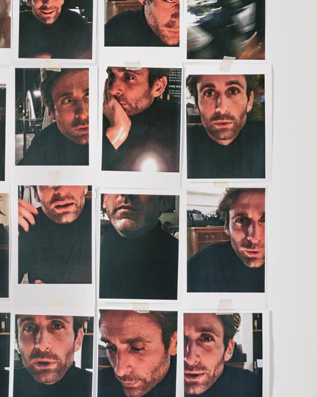
In design terms, Another Love Story is reminiscent of a scrapbook, using torn strips of masking tape to roughly affix images so as to seem informal, some of which are afforded an additional sense of casual intimacy through domestic settings. In April, however, spectacular mountain views are made backdrop to a shot with the actor playing X’s head cut clean off and the photographer’s shown. In an adjacent image, further psychological layering takes place through multiple reflections in glass, splintering and fragmenting X as subject through the photographer’s gaze. In a number of instances, Hiraldo Voleau includes intensive repetition of the man’s face, as if the photographer (or viewer) is trying to work X out or, perhaps, as if to search for comparisons between X and the actor she has cast to play him. At the least, there is something verging on the voyeuristic in the repetitions, subjects that the photographer has explored in past bodies of work such as Hola Mi Amol (2019). A range of formats including small-scale prints arranged in lines and grids are mixed with full-bleeds. Resolution varies, and, while reaffirming the materiality of the images, the design of the book also references social media feeds and mobile phone camera rolls, those digital spaces that document, shape and underpin the ways lives are lived. These spaces are also part of the mechanisms through which relationships might be created and conveyed publicly, notable because in Hiraldo Voleau’s project, she intentionally re-visits and re-produces images that are personally significant after the fact.
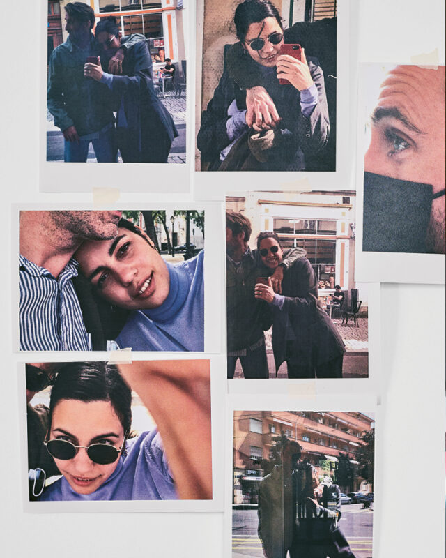
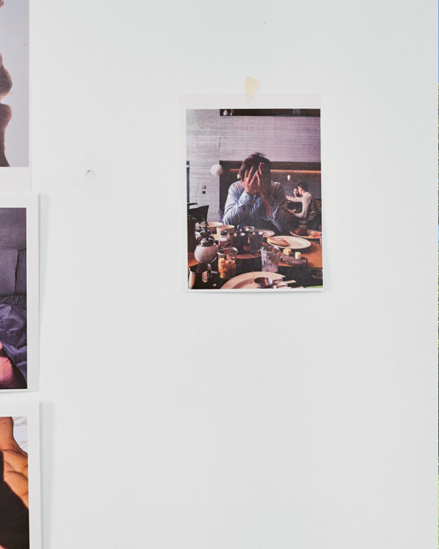
May, the penultimate chapter, begins with sweaty bodies and smiling faces. These make way overleaf for images where photographer and actor-X are depicted wearing face masks on public transport, the bottom half of their faces redacted and unreadable. Actor-X sits at a restaurant table with his head in his hands, his face again hidden from sight. With June comes further obfuscation, a laptop now covering the lower half of his face. The concluding photograph in the book is a view in a car. Actor-X wears sunglasses, with the top half of his face glimpsed in the rear-view mirror in the top portion of the photograph. Through the windscreen, an open road lies ahead.
Three further text messages form an epilogue to the book. In this conversation between Hiraldo Voleau and A, who have formed, in a more genuinely surprising narrative twist, some sort of cathartic alliance in their shared experiences of X, there are self-reflexive mentions of the project, including its exhibition iterations which began with a display at MEP Studio in Paris in 2022. Optimistically, these snatches of text give both women some sense of closure. Hiraldo Voleau concludes: “Thank you. Nothing changes, I’m still so grateful that it is YOU in all of this. The show being in quite a long time, I’ll invite you to come later on. Please feel free to do so if you want! All the best til then!” ♦
All images courtesy the artist and Mörel © Karla Hiraldo Voleau
Another Love Story is published by Mörel.
—
Anneka French is a Curator at Coventry Biennial and Project Editor for Anomie, an international publishing house for the arts. She contributes to Art Quarterly, Burlington Contemporary and Photomonitor, and has had written and editorial commissions from Turner Prize, Fire Station Artists’ Studios, TACO!, Photoworks+ and Grain Projects. French served as Co-ordinator and then Director at New Art West Midlands, Editorial Manager at this is tomorrow and has worked at Tate Modern, London, Ikon, Birmingham and The New Art Gallery Walsall.